Welcome to Sixth Grade HTML. In this lesson we'll consider how to write GOOD HTML.
Instructional style - "Today we're going to study the Exxon Valdez oil spill, one of the greatest environmental disasters in history. The devastation of Prince William Sound, one of the most ecologically sensitive areas on earth,..."
Impressive Web Pages
Web pages intended to impress the viewer are a little more fancy. I like to think the webpage we studied in fifth grade was somewhat impressive, even though it's over a generation older now, just like me. you can check out my new one if you are interested. The one we'll talk about used graphics, music, flashing lights and colors to grab the viewer's attention. For a different approach, take a look at the Vatican website, which is impressive in a different way. I love the way they use graphics as links, that we learned about in fourth grade.
To start with, let's look at the page we studied in fifth grade. This is one of the later steps of the evolution of "my" web page, what people would see when I said, "Take a look at my web page." It introduces and represents me. This is the first thing the viewer sees:
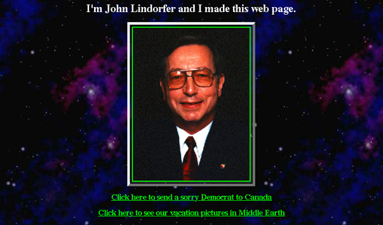
Here I am, smiling out at the viewer from the immensity of the cosmos. The first words, "I'm John Lindorfer and I made this web page" are, of course, reminiscent of President Bush's campaign advertisements. It tells you who I am and, incidentally, that I'm a web page maker. The intended effect is to suggest that I'm an important, responsible, (good looking!) person whose views you should take seriously.
"Click here to send a sorry Democrat to Canada." "Click here to see our vacation pictures in Middle Earth," "Click here to find out how to become richer than Bill Gates!" "Click here for a text only version," "Click here to send me e-mail" A little human interest and humor here. The "Click here to send me e-mail" link is up front because some viewers are looking for my e-mail address, and this makes it possible for them to get straight to business if they just want to send me a message.
The Star Trek graphic, song, music and scout oath are intended to get the viewer interested. "Hey, Francine, this guy is OK. Look, he's got a little space ship flying across the screen! Cool!" Note that I have put the music player bar right up front, where the viewer can turn it off if he wants. I find background music annoying if I can't control it (If the music player bar is grayed out, you don't have a compatible plugin.)
"God bless George Bush and the United States of America!" "Welcome to my home page," "Let's go back to the moon...On our way to Mars!"... just a few more ideas I've thrown in. Viewers may have my "Middle Earth Wizard" card, so inclusion here shows them they're at the right place.
Down to the middle of the page, this document is essentially a resume', which is basically what it's for. A resume' is the accepted method of telling someone about oneself, so I figured it would be appropriate here. Who knows, somebody may offer me a job! (not that I'm looking for work, but it's nice to feel wanted)
I have no control over most of the links, which were good when I inserted them, but may be outdated now. Every so often I have to clean them up. It doesn't matter, really, since they're not essential to understanding what's there. If people want to know what the International Space Station is, for example, they can use the link provided, but it's not really necessary.
The sermons, lectures and other ramblings have evolved over the last few years from my professional and personal writings. I don't include them because they take up a lot of space, and most viewers won't care. They can click on the links if they think they might be interested. The sermons are keyed to specific passages in Scripture, so I have included links to the Bible where appropriate if anyone wants to check them out.
Then there are pictures of my children. Like many fathers, I like to show people pictures of my kids.
I thought the picture of the world and our beach were so interesting that I included them. Maybe others would be interested, maybe not.
The rest of the page is just miscellaneous stuff that I think viewers might find interesting. Food for thought, here.
I have some other thoughts that scroll unobtrusively across the bottom of the page. I change them from time to time as the muse moves me. I think they accurately express my opinions on things, and give the viewer a little more insight into who I am.
The animated horizontal rules are straight out of the Star Trek programs, and seem to go well with the overall theme. They are repeated 11 times, but only have to load once, so they don't take up too much time to load.
If you click on any of the sermons, lectures and other ramblings, you get an idea of how I like to design my web pages. Of course, these are noncommercial pages which are intended to express ideas, not sell products. Commercial pages are more glitzy and glamorous, but I'm assuming that the average HTML writer is basically like me, someone who is putting something on the Internet for others to read without trying to get them to buy anything. Here are some of my guidelines.
Some Guidelines for Web Pages
I like to use titles and headlines to let the reader know what he's looking at. Usually the title is repeated in a headline, but not always. One can use a title for notification purposes, such as "Warning - Contents of this site may be objectionable to perverts." Then I don't feel that I have to apologize to any perverts who might be offended by what I'm saying.
I like to specify the background. Backgrounds should not detract from the text. If I want to simulate a textbook, such as in this document, I specify <body bgcolor="white"> in the body of the document. For most of my pages, I use a kind of marble background at http://lindorfer.us/wizard/Graphics/frmarbl.jpg. I like the "cosmos" background at http://lindorfer.us/wizard/Graphics/starfiel.jpg for dramatic effect. For instance, see my "Star Wars" format at The Letters of Timothy, of which I am moderately proud. Once again, I put the music controls up front. I also included links to the alternate texts if some people can't read them in the "scrolling plaque."
I like generally to introduce my text with a picture or other graphic, which gets the viewer interested, sets the tone, and sometimes shows what is being discussed. A picture is worth a thousand words. (Actually, they're worth much more in terms of disk space and loading time.) I like to use a five pixel table border to form a picture frame. Sometimes you need several graphics, as in a tutorial.
I prefer to use GIF or JPG format for my graphics. GIF is best for simple graphics, line sketches and anime-type drawings. JPG was designed specifically for digital storage of photographs. GIFs can be animated.
Graphics should be used in moderation. They should be small. If you have something very large you want your viewer to see, include a small one as a thumbnail and make it a link to the full sized one. That way the page doesn't take so long to load.
Regarding graphics, Some web page designers like to use graphics for everything, hundreds of them in some cases. Some of them consist of a single pixel. Stupid!
One of the most annoying use of graphics, in my opinion, is to use graphics in lieu of text. Some web page designers think it's cool to have little tabs or tags with words on them, but each of these takes up as much loading time as hundreds, sometimes thousands, of words. Often you can sit for minutes at a time watching a client look all over the world for little graphics to decorate a web page. I'm against this. If you need a picture, use a picture. If you need a piece of text, use a piece of text.
Links should be used to help your viewer get more information. I like to use a link any time I think a viewer might be unfamiliar with what I'm talking about, or might want to look something up, such as a Scriptural reference. I'll admit I don't follow any hard and fast rules, though. I try to make the link informative and rather short. The purpose of the link is, after all, to be able to call up other text, not to explain it. Most of the tutorials I've read on HTML say you should never use "click here" in a link, but I don't agree. If you want your viewer to click somewhere, "click here" tells him that.
Try to keep formatting to a minimum. Tables and lists may be necessary, but specifying specific fonts or styles or whatnot simply extends loading time. HTML editors and generator programs like to specify virtually everything; I'm against them for that reason, as well as others.
Convincing Web Pages
A convincing web page is an informational web page on steroids. Strictly speaking, convincing someone involves making him believe something is true that he already knows, but doesn't believe. Practically, you have to tell him what you want him to believe (inform him) and then make him believe it (convince him).
The informing part follows the guidelines for informational web pages. It's important to be concise, logical and thorough. My mentor, Earl McNail, used to emphasize that "You've got to tell him what you're going to tell him, then tell him what you want to tell him, then tell him what you told him." I think that is true. Then you have to make him believe it. I think it helps to determine beforehand, in as few words as possible, exactly and precisely what idea(s) you are trying to put across, and then proceed to propose and explain sufficiently that your viewer has no doubt about what it is you want him to believe. Then you can work on the believing part.
Getting a person to believe something depends very much on who he or she is. Willingness to believe is heavily influenced by experience, including cultural background. If you are writing for a specific audience, it helps to know as much as possible about that audience. Generally, you will be writing for Americans, who are a diverse lot. On the other hand, most Americans like to believe things, since most subscribe to religions which require, or at least encourage, them to believe all sorts of unbelievable things before breakfast. To get someone to believe something, you can appeal to his emotions, point out that he already believes it, show how what you propose is a logical conclusion from what he already believes, or appeal to some authority that the viewer (not necessarily you) accepts. You can use these in combination. For example....
| The Situation: | Police want to convince a potential suicide that he should get off a bridge | A Creationist wants to convince his audience that evolution is wrong | A preacher wants to convince his congregation they should contribute money to fix a leaky roof | "Paw Paw" Dub Herring wants to sell his TV audience a used car |
|---|
| Appeal to emotion | You seem like an intelligent guy. | Oh, woe to those who don't believe the word of God! | Oh, the wonders of the love of God! | Folks, this is your good friend, Paw Paw Dub Herring in Picayune, Mississippi! |
| Established belief | You really don't want to hurt yourself. | The Bible is the source of God's revelation to mankind. | Fixing our leaky roof is going to cost a lot of money. | Everybody likes a good deal; |
| Logical conclusion | That's what's going to happen if you don't get down. | Evolution denies the plain words of the Bible, | And God will love you if you help fix it. | ... and, friends, we've got just the deal for you! |
| Appeal to authority | Besides, you're breaking the law by being up there. | which says in the Book of Genesis, that God created the heavens and the earth! | As Saint Paul says in 2 Corinthians 9:7, "God loveth a cheerful giver!" | A year old Corvette, with all the features that you like, for $3200 off the list price! |
Notice that conviction has nothing to do with truth. It is just as easy to get people to believe things that are not true as it is to get them to believe true things. Donald Trump does it all the time! Emotions have nothing whatever to do with truth; neither does what one already believes. You can induce people to embrace all kinds of really strange ideas if you can show that they are logical conclusions from the premise that the problems of black people are all due to white subjugation, the Supreme Court wants to promote atheism, The US invaded Iraq to steal their oil, TSA screening at airports keeps us safe from terrorists, Michael Schiavo killed his wife for her money, or that the 2020 election was stolen by the Democrats, who actually lost!
About the only sure criterion of truth seems to me to be the veracity of the authority one uses, and even then, one must be very careful to be honest in applying that that authority actually says. Most folks I know accept the Bible as a compendium of truth, but they often disagree, sometimes violently, on what the Bible says about specific propositions. I have always thought bibles should contain a warning label that says that.
Some people like to appeal to "common sense," but common sense is actually established belief, call it prejudice if you want, and varies from person to person. What I think is common sense might be the opposite of what you think is common sense, and both of us may be dead wrong. You can appeal to the viewer's idea of common sense, of course, but you need to be careful that you know what that is.
These appeals are facilitated by extensive use of links to documents that show what the established belief is, or that recognized authority supports your position. I find the Bible and the Catechism of the Catholic Church, as well as encyclicals and other papal writings, useful in trying to convince my viewers of religious ideas. Links to the Constitution or decisions of the Supreme Court are useful in discussing law and civil rights. If you know that you and your viewer accept some common authority, use that.
You can generate emotion by using an emotional "grabber," such as a picture of happy (or starving) children, or a picture of soldiers or the Flag, and then appeal to that emotion in your text.
Web Pages That Entertain
I think entertainment is in the mind of the entertainee. I like to inject a little humor into almost every web page I write because I'm a friendly guy who likes to make people smile and maybe laugh occasionally. Some people don't like that, and I respect their sensibilities by either being very serious around them or, usually, by leaving them alone. But I don't have any web pages that are ONLY for entertainment, so I really don't have any specific ideas on how to make them.
It seems to me that entertaining web pages benefit from lots of formatting and graphics. Glitz and glitter! Razzle-dazzle! They probably don't use too many links; where would someone want to go if he's ALREADY having a good time?
On the other hand, I think any web page ought to avoid irresponsibility. I defend a person's RIGHT to publish pornography and other material that is inappropriate for little kids, but I think it should be kept under the rug with the other filth. If it's risque', I think the writer should figure out how to keep it away from children and then do that. Requiring a credit card number to enter an offensive web site might be one way. I think people should be warned if content is likely to offend contemporary community standards. On the other hand, some of my more conservative friends have criticized some of my web pages as being inappropriate for their children. I think it's best if they don't let their children see them.
I think we should all try to make the Internet more economical and reliable by using hypertext transfer protocol (http) for what it's for, transferring text and associated (limited) graphics. Web pages that use http and include unnecessary live audio or video seem to me to be irresponsible, and I avoid them for that reason. If your client is taking a long time to load a page, it's probably because the Internet is being clogged up with morons using their computers as radios or televisions. Don't let one of them be you! If you want satellite radio or TV, get satellite radio or TV.
Web Pages That Gain Action
Motivation, or gaining action, is the difference between conviction, which you do to the mind of the viewer when he's looking at your web page, and persuasion, which makes him do something. It helps if you can convince him that he ought to do it, so motivational web pages are essentially additions to convincing web pages. In our little example above, the motivational aspect might be:
| The Situation: | Police want to convince a potential suicide that he should get off a bridge | A Creationist wants to convince his audience that evolution is wrong | A preacher wants to convince his congregation they should contribute money to fix a leaky roof | "Paw Paw" Dub Herring wants to sell his TV audience a used car |
|---|
| The Motivational Addition: | C'mon, I'll help you get down. Just take my hand. Careful, now! | So cast out those evil "scientific" doubts and let God into your life! | So dig down deep into your pockets, and show God how much you value His love! | So come on down to Picayune, Mississippi, and tell 'em Paw Paw sent you! (That's a good car, Paw Paw!) |
Perhaps the most simple motivation is "click here." Obviously, you want the viewer to do that. It helps if you can motivate him a little, such as:
Did you click there? Which one did you pick first?
Commercial web pages are usually motivational, because they try to get you to do something, usually to go through the complete process necessary to buy a product or service that the sponsor wants to sell. There are multiple purposes here, because the sponsor needs to inform the potential customer what the products or services are, impress him with how good or desirable they are, convince him that he should buy one or more of them, and then motivate him to select the one(s) he wants, place an order, and arrange for payment.
Unfortunately, commercial web designers often concentrate on the "design" to the detriment of the "commercial." Their pages may be slick and glitzy, but don't give essential information required by the customer, such as what products are available and how to order them. Really! For example, Radio Shack discontinued its catalog and established a website that was supposed to replace it, but the website was so hard to use, and so badly maintained, that even the Radio Shack store employees couldn't find things using it. As a result, if your local store didn't have it, you couldn't order it. We all know what happened to Radio Shack, right?
A Customer's Guidelines for Commercial Web Pages
I'm not a commercial web page designer any more than I am a brain surgeon, but I have a few ideas that I think commercial web page writers would do well to consider. The first one is to determine why one is writing it in the first place. I find it annoying when I want to buy something, look it up on Google, and then have to click through page after page that tells me what great deals I can get on the thing, how wonderful it is, how it is superior to everybody else's thing, how fantastic the company that makes the thing is, who founded it, how that person had to struggle, how I can invest in the company, what their latest press releases are, et cetera, et cetera, et cetera, but don't tell me how to buy the darn thing, how much it costs, and how to pay for it. If a company is selling something, the first purpose of a web page ought to be to help a potential customer buy it!
What follows are my thoughts about what I think would enhance a web page that is designed to motivate someone to buy something. These are in addition to the foregoing general guidelines for web pages. They are:
- Plan the first page to be about the same size you expect the viewer's screen to be, or a little smaller, so he doesn't have to scroll. If you need long pages, link to them from other pages.
- Make the company logo the first thing the customer sees by putting it in the upper left corner. That lets the customer know he's in the right place.
- Include a title that says what the page is, such as "Radio Shack Home Page" or "Welcome to Radio Shack." (It never hurts to be polite.) The customer already knows the URL of the page, it's in his "location" box. The title should tell him what the page is; he already knows how to find it.
- Include a table of contents or an index with entries that the customer can click on. This should include as a minimum, links to:
- A list of products - This can be followed with a little box that allows the customer to type in a keyword or product number to open a page featuring a specific product if you know how to do that.
- A list of services provided, if any.
- A link to information about the company, officers, e-mail addresses, stock information, and so on. The customer may want to just buy the product, not find out about its where it came from.
- Current national advertisements the customer may have seen.
- Short informational graphics about sales or special offers, discounts, coupons
- Links to tutorials, product selection guides, or other special information the company provides to help the customer decide what product to buy. (You WANT to help the customer decide what product to buy!)
- Specify a telephone number the customer can call for additional information, and the day, time and time zone that the telephone is always answered. Include a picture of a someone wearing a headset. Make sure that someone looks like he or she represents your company. If you provide a telephone number, make sure someone is there to answer the telephone. Getting a recorded message to see your website is annoying to someone who has already done that. If you routinely answer your telephone with a recorded message to see your website, make the number on your website another number that is answered by a real, live human being. Don't use this number to record a customer's message!
- Display your FAX number, if you have one.
- Show your company e-mail address, and the time after e-mailing you that the customer can expect a response. Respond within that time.
- List your company physical address and mailing addresses for various departments, such as customer service, stock inquires, employment opportunities and suchlike.
- Include a MAILTO address with a link that says something like, "Questions? Comments? Can't find what you're looking for? Click here!" Hire someone to answer these e-mails right away, within minutes if possible.
- If your company has retail stores, provide links to information about them. If you have a lot of retail stores, allow the customer to type in a five digit zip code (if you know how) to find stores in his area. Include at least three stores so the customer has a choice if he doesn't like one. For each store, provide a link that:
- Shows a picture of the store
- Provides a map that shows where the store is. GPS coordinates can't hurt, either.
- Gives the mailing address, e-mail address, telephone number, FAX number and name and picture of the store manager
- Tells when the store is open
- Gives any special information about the store ("repair service available," "across the street from the cable company," for example)
- Identify methods of payment you accept, information about time payment plans and special discounts for military, the elderly or people with special needs.
- Tell how to return a product, what your policy is on returns, and provide a telephone number (and the time that it is answered) specifically intended for people who want to return things.
- If you are associated with a trade association, professional association, or other entity that the customer might want to know about, identify them and include their logos.
- If you have any special deals, sales, new items, major company changes, news about the company, and so on, put them on this page. These should be limited to about half a dozen items. If you have more, provide them on a separate page and provide links to them.
- Use small graphics profusely. You want to get your message across to the customer as quickly as possible, preferably within a second or two. The right graphics do this. Give some thought to selecting precisely the right ones.
- In your product (and service) catalog, provide a list of links arranged alphabetically or, if there are more than a dozen items, provide categories alphabetically and use those as links.
- Link to at least one list of all products and services listed alphabetically, but make this the last link in the list. That way, if the customer can't find what he wants by category, he can always go to the alphabetical list to look for it. If it's not listed there, you don't sell it.
- For each product, provide a small graphic, preferably in color, that shows the product along with a title, description, and stock number or a list of stock numbers if there is more than one because of color, style, size, or some other criteria. Tell what the product is, what it does, what it is used for, and why the customer should have it. Use tables to compare products if such a comparison makes sense.
- Always provide a price for each product. Also provide shipping weight and dimensions if the shipping costs are affected. If there are any shipping restrictions, tell what they are
- If the product is a substance, like glue, laundry detergent, or paint thinner, show a picture of the product container and tell what the product is, what it does, how it's used, circumstances in which it should not be used, and the size containers it comes in and the price of each. If you offer a discount for bulk quantities, say so.
- Provide discussions or tutorials to educate customers regarding how your products might fulfill their needs. For comparison or competing products, tell what they are, what they do, how they're used and how they're measured, rated or specified. Assume your customer is ignorant, not stupid.
- Provide specifications that the customer is interested in. If one product is good, others are better, and another is best, tell why.
- If you have a really expensive thing that most customers won't need because it is only for professional users, has extra features that most people won't use, or has costly non-functional decoration, point that out. It makes you appear honest and just might induce the customer to buy it anyway.
- Test your website by visiting a high school (not a college; they're smarter than the average customer) and offering $10 prizes and a $100 grand prize, prior to a specific "end" date, for any criticism or suggestion for improvement that results in a modification. Maybe you can make it part of a software writing or marketing class. Award several such prizes, and the grand prize, in some kind of ceremony. Invite the press. Charge the cost to "advertising." It always pays to advertise!
- Maintain your site meticulously. Make sure all your product descriptions and prices are current. Never (note, never) delete a target of a link without deleting or changing the link itself. Having a link to a "not found" page makes your company look sneaky!
- Keep in mind that your website, including all the pages it links to, and their links, has as it's purposes:
- Making a favorable first impression on the customer
- Making him want to buy from you, rather than your competitor
- Identifying the products or services you want him to buy
- Convincing him he should do that
- Assisting him with his selection so he enjoys (or at least is not annoyed by) making it
- Inducing him to make a selection
- Inducing him to order the product and pay for it
- Answering his questions
- Making him believe he got a really good deal
- Leaving him with a favorable impression of your company
- Making him want to do business with you again and tell his friends good things about his experience with you
Chances are good that if you are a business executive contemplating a commercial web page design, you'll want one as good or better than those of your competitors, so you will want to invest in a commercial web page designer. That's OK; it's your money. I think it is helpful, though, to give thought to the design of your company's web page and what you want it to do and say as well as what you want it to look like. This allows you to communicate to your expensive web page designer what you want him to do so that you get your money's worth. Remember, if it doesn't do what you want, you paid too much!
Pet Peeves
I have a few pet peeves about web pages that I'll pass along for what they're worth. Maybe they don't annoy you as much as they do me, but they really annoy me because I think they are criminally arrogant! I don't do business with organizations that are guilty of them!
- I just hate those little boxes that pop up when you click on a link that says "contact us" or "feedback" that asks for your e-mail address and then has a box for the text. Who the heck do these people think they are, anyway? If they want me to send them e-mail, use a MAILTO link like normal people! Yeah, I know, it's all part of a special program THEY use that searches the text for key words and keeps track of harvestable e-mail addresses for THEM, but THEY can do that with regular e-mail that allows MY e-mail client to keep a copy of MY e-mail in MY "sent" box and files it the way MY preferences specify. Either use a normal e-mail client, or don't use e-mail!
- An associated nuisance is a web server that sends its supposed customers "do not reply" emails. If they can email me, why aren't they interested in me enough to let me email them? I tend not to read them!
- Same goes with special plugins that you have to download or, worse yet, don't work. If I can't see a page because it requires a plugin I don't have, I don't see it. Life is too short to waste on that kind of stuff!
- And I think it's immoral and unpatriotic to encourage people who are so arrogant that they require me to use a specific client to view their sacred web pages. A certain news organization used to do this. For Windows, they wanted you to use Internet Explorer 5 or greater, Firefox, or Opera. For Macintosh, they wanted me to use Safari, Firefox, or Opera. For Unix/Linux, you're suppose to use only Firefox or Opera. I use what client I please. This is the United States of America, not North Korea. Note to people who do this: If this is your site, I don't read it!
Another pet peeve of mine that pertains to both advertiser's websites and their telephone messages are those that waste the customer's time. If your website has a telephone link, whatever you are planning to say in a recorded message should be posted on the website instead. You should have already have told him in writing what he wants to know; if he calls you, he wants to talk to somebody! He especially does NOT want to hear things that you should have told him on your website, or why you don't have enought interest or people to talk to him. "We are experiencing a high volume..." means that you don't care enough about him to have already hired a large enough number of customer service representatives. So does telling him how long he has to wait before one of your employees cares enough to pick up the phone and talk to him. Besides, both of those statements are basically lies! Whom do you think you're kidding? If his "call is very important" to you, answer the telephone!
And finally, if your customer has managed to navigate the unusually high volume of telephone calls, and outwaited the waiting time while all your agents are assisting other customers and ignoring him, and actually gets to talk to somebody who represents your business, try to actually address his concerns. If he's calling about noise on your company's telephone line, for example, don't explain how to reset his personal identification number!
OK, so now you have some basic information about writing HTML documents. You can get some more from other on-line references or at your local book store or library. At this point, you are ready to study on your own or take a formal course.
You are now ready for Junior High HTML.
Good Luck!
John Lindorfer
 It is helpful to use established writing techniques to present information. Hopefully, you learned these in school. You start with a "grabber" and then go on from there. The "grabber" gets the reader's attention and entices him to continue reading. It can be an interesting graphic or some text. I usually like to use a graphic. On a book or magazine, it's the cover, but web pages don't have covers. Three examples of text "grabbers" come to mind: